Michal Janicki is a talented designer whose striking theater posters for Chicago’s Trap Door Theatre caught the eye of the E-CIBS editorial cadre. In this interview, he converses with E-CIBS co-editor Anthony Squiers to discuss his work. Janicki shares his creative process, inspirations, and challenges, offering a behind-the-scenes look at how his designs shape the visual identity of performances and attract audiences.
Michal, thanks for taking the time for us. Could you start us off by describing how you approach designing a poster for a theater production? Do you begin with the script, the director’s vision, or something else?
My favorite way to experience and learn about the work is to visit during rehearsals so I can see the script “come alive.” I find this to be the best way to communicate with the director, seeing them mold the vision to reach particular emotional beats with the actors. At Trap Door, we photograph the actors for each production, so we rely a ton on their faces to communicate emotions through the lens. This works well with experienced actors, and can be tricky with those just starting out. With the right actor and director, they can travel deep into the text and bring that in front of the lens, essentially doing the work for me. This requires a lot of trust, and that trust is best built on previous experiences.
I have had the privilege to work with extremely trusting directors, actors, dramaturgs, costume and make-up designers, really everyone that makes the shows come together. The artistic director, Beata Pilch and I have a very long relationship and a common goal of bringing avant-garde work to life. So even if we disagree on something, that common goal and passion still holds our vision together.
You’ve designed posters for several productions of Brecht and Müller. Could you share your approach to creating those posters?
Max Truax, who directed these works, is a long-time collaborator. He has a particular directorial style: I call it a black-metal concert meets somnambulism. His direction puts me in a sort-of frightful tunnel vision where he amplifies particular elements and details of the work. It’s like floating in a dark dream: it’s scary but thrilling too! Music and sound are such important elements he utilizes to get beneath the surface of an often hard to penetrate play. I try to bring that focus to the visual expression of the posters, and learn from him as much as I can. He has an amazing ability to frame a scene and create cinematic movement on a stage.
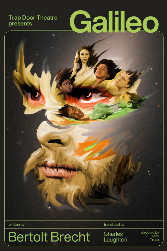
For Galileo, there was this idea of the strength of inevitability, the gravity of truth, so to me it was the main character as a celestial body, being pulled on or pushed by the other characters orbiting him. We took a few photos, during a rehearsal with the entire cast, and later combined that with an image of the night sky and very exacting typography. Because the play doesn’t anchor on a particular time period, I thought of the promise of modernism to bring balance and order, and the flip-side of it erasing personality.
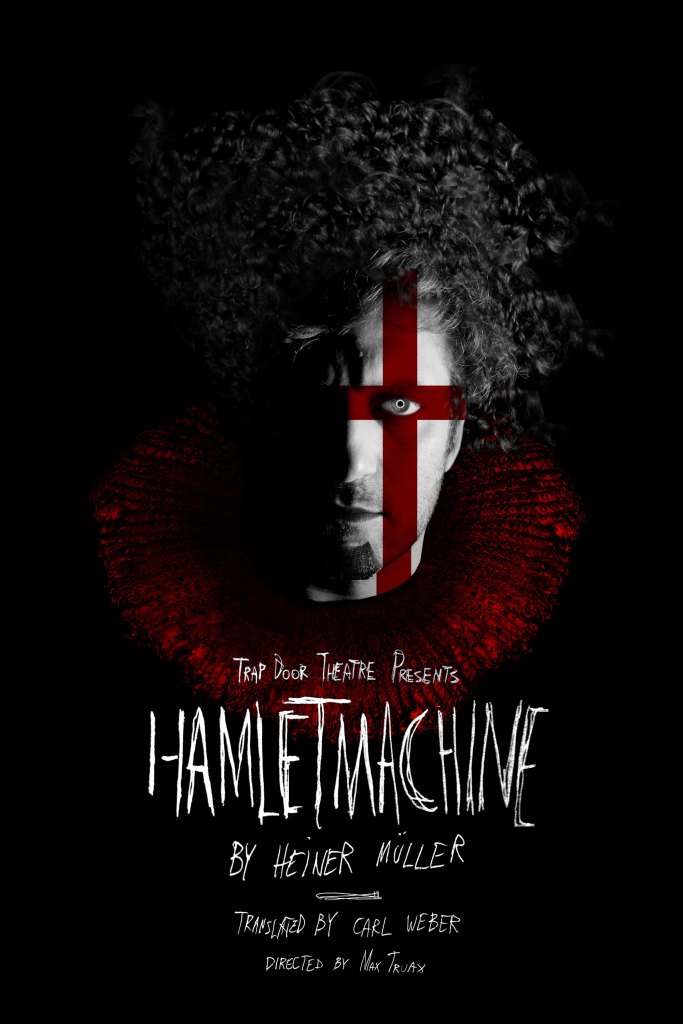
For Hamletmachine, it was all about the face and the flag: the relationship between a ruler and the ruled. Because the play can be so inaccessible, I was craving the simplest, most minimal expression of this idea, giving potential viewers an anchor before they experienced a fractured opera where many actors often play the same character. The fractured feeling is a bit harder to discern at first glance, I composed a wig and a ruff, and brought a more mechanical eye to the character – my easter egg of blurring the boundary between contemporary and classic.
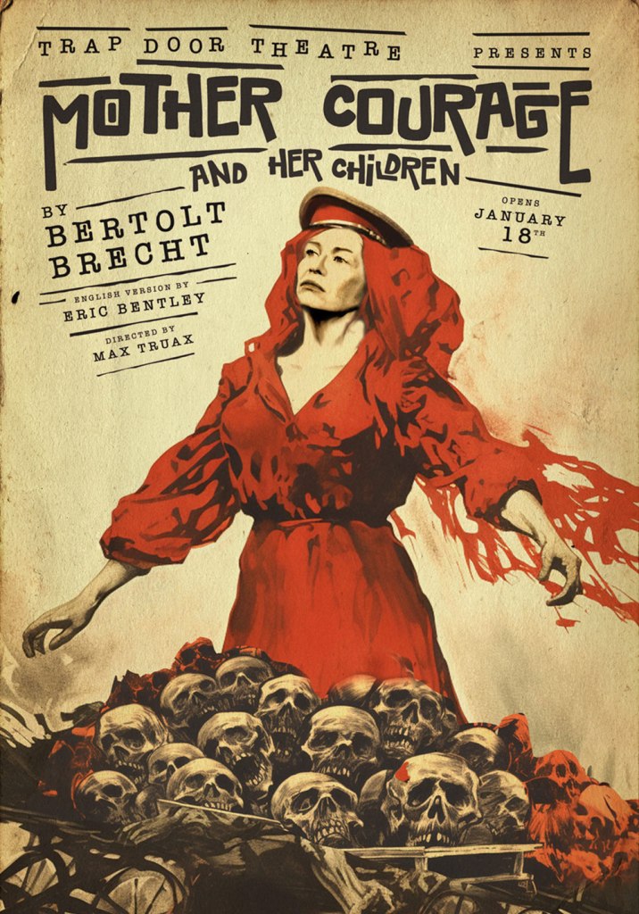
Mother Courage and Her Children brought up memories of growing up during communism. I remember being so scared when my dad who was in the army and another soldier snuck a huge piece of frozen beef to our tiny apartment in the middle of the night to skirt the food rations that were in place at the time. The ice mashed up under their dirty boots, and my mother was almost floating in a nightgown directing their steps in near darkness and silence, looking so stern but also so sure of the righteousness of her kids having food to eat by any means. This determinism terrified, and reading the work, it brought all these feelings to the surface. There’s a sort of proto-European compartment in my brain where these heroics have a yellowed look, hand-set typography and East European-inspired drawing style. Sometimes I feel the entire history of the land I come from is steeped in various stories of violence being seen as either heroic or despicable, but always inevitable. This was a rare instance where I knew the exact look the second I knew I got to work on the play.
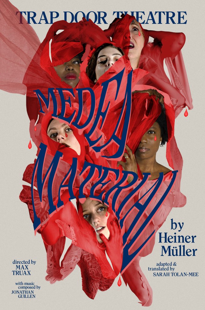
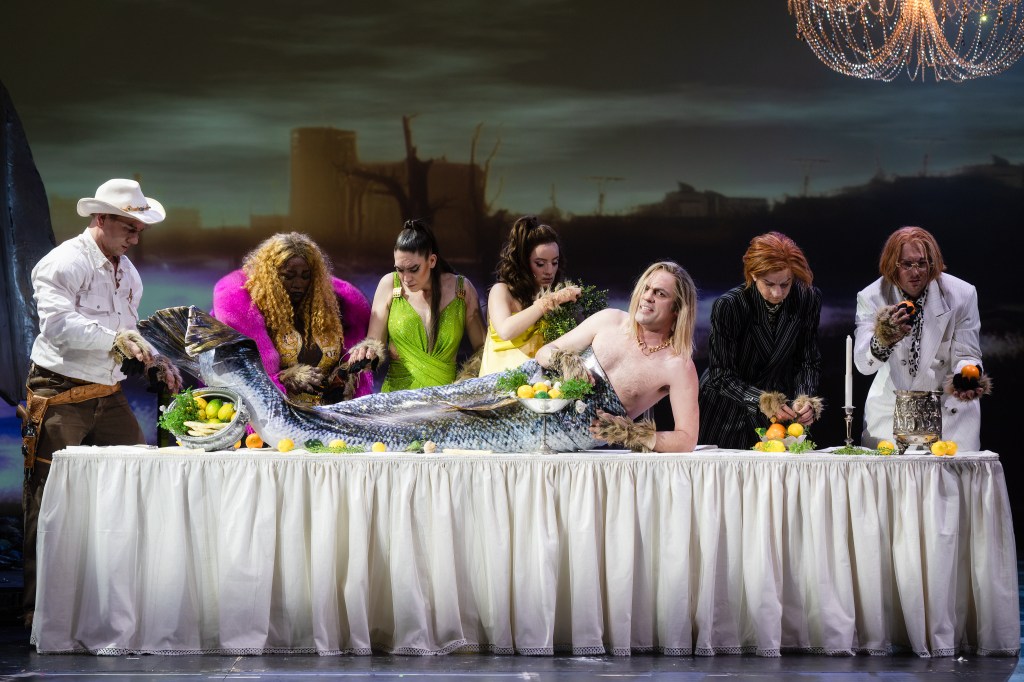
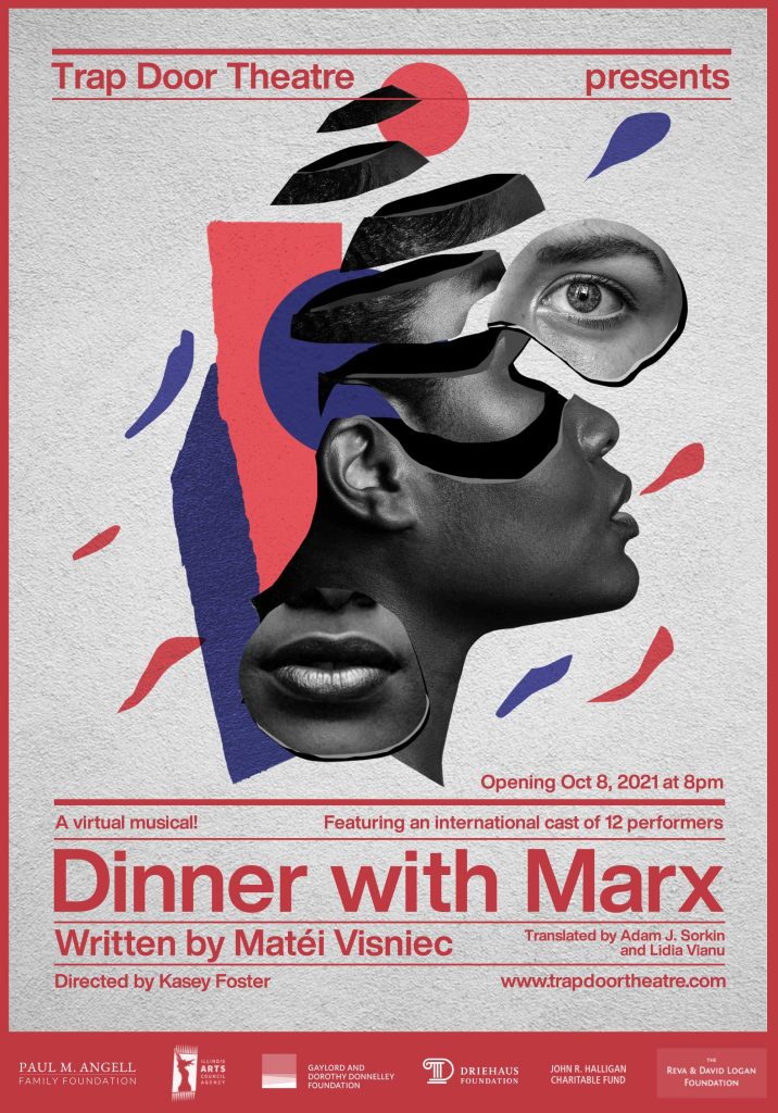
Medea Material came from Max’s idea of a wedding gown – and having all the actors who portrayed Medea being featured. The gown tangles them into a floating mess, and the type similarly flows in the organic shape. The dress starts to look like a bandage, so we tried it in red – while disturbing, the actor’s gaze draws us in, tangling us in the mess. A floating chimera of trauma and fractured personality of sorts – I was worried about alienating people, but the risk paid off and audiences still showed up.

You’ve provided us with a selection of your work. Why did you choose these particular pieces, and what do they reveal about your design process?
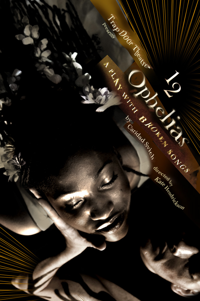
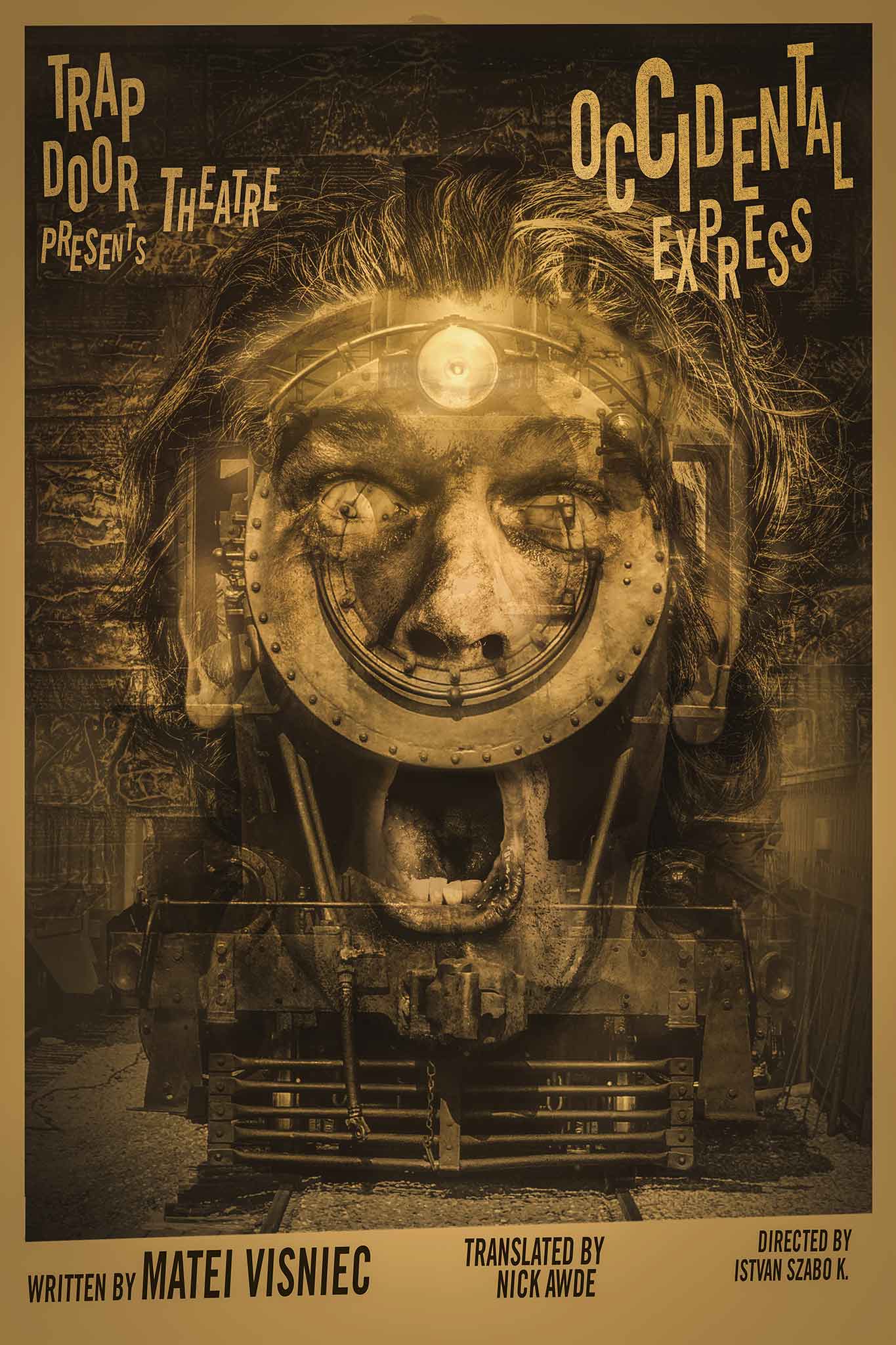
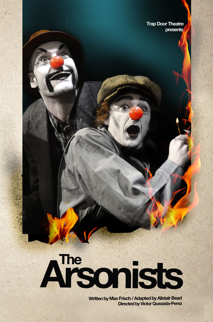
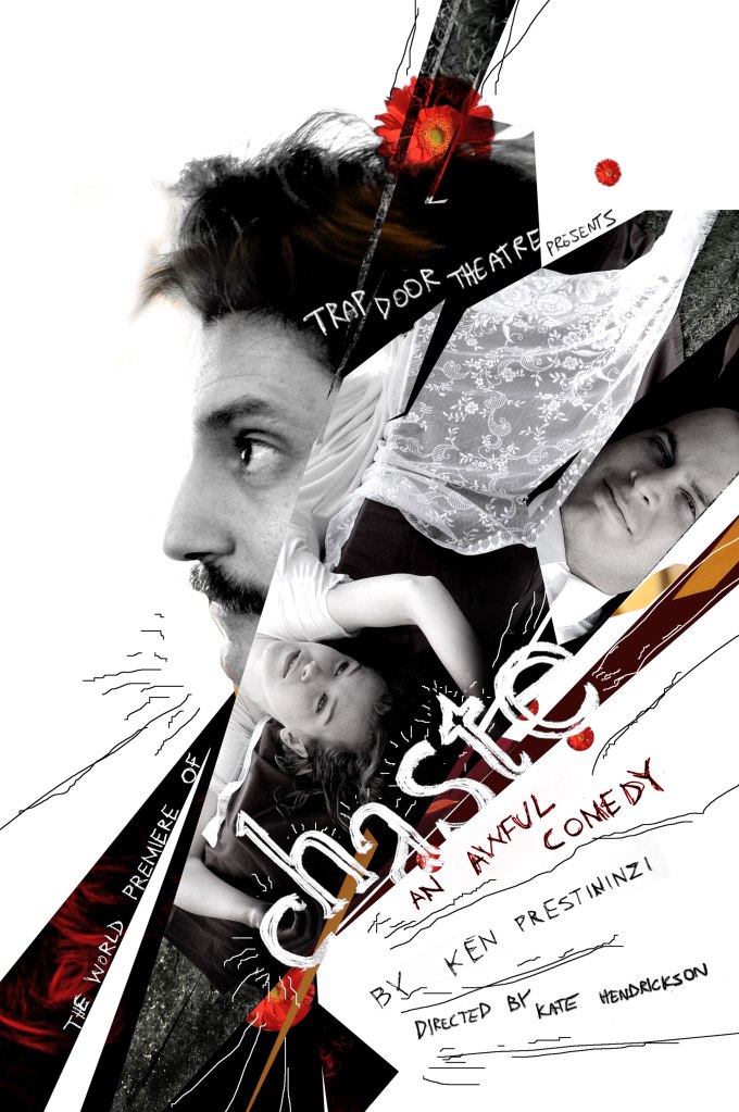
The posters I selected focus on political theatre and a contemporary view of classic stories. A few seemed to have clear common roots (like 12 Ophelias and Hamletmachine), others brought the horror-comedy of social hierarchy to the front like The Arsonists or Occidental Express. It’s really hard to pick favorites, because each of these plays has such a deep impact on me, and all works at Trap Door Theatre are quite unified thematically, whether it is a classic, well established European playwright, or a modern American one.
I am increasingly more alarmed at how much the absurdity portrayed in the plays is re-manifesting in our world.
As time has advanced, I am increasingly more alarmed at how much the absurdity portrayed in the plays is re-manifesting in our world. Seeing these echoes of grotesque violence become amplified across the world brings chills to me that I’m still having a hard time describing, and it brings more gravity to unearthing and revisiting this work with a contemporary audience.
What are some of the biggest challenges in designing theater posters, and how do you overcome them?
The challenges are quite universal to any creative endeavor. There is not a lot of money to be made in an area with a lot of effort and heartbreak. At times during rehearsals I’ll get very emotional, because the people that are there, the actors, dramaturgs, directors, costume designers… They’re all there because they are passionate about live theater. What’s more, they are passionate about avant-garde theatre, works that are not always made with pleasing the audience in mind. We’re there because this work spoke to us on some personal level, and even if we can’t articulate the reasons, it’s paramount we work on it. But this way of working can sometimes become unsustainable – life outside of creativity happens, we have others to take care of, and we ourselves are continuously aging. We are not exempt from operating in systems that prioritize things other than theater, and we have to find a balance. With balance, we can continue to show up in ways that sustain what we care about without burning out.
How has your style or approach evolved over time? Have any major shifts in the industry influenced your work?
Trap Door Theatre has consistently been a place that encourages me to experiment with my design practice. You’ll notice what many graphic design professionals would call “a lack of clear identity elements” in the posters: that means no consistent typography, framing devices, colors, or even a logo! And yet, they still work together as a whole. This is very intentional – much of what we think of as “good graphic design” is informed by the advertising industry, and the idea of throwing “branding” out the window a little keeps me inspired and eager to start each project from scratch. In many other areas of my practice the idea of “productivity” is so important. It makes me smile thinking of ‘productivity’ as something to apply to this work as it is almost the opposite of being productive. This work feeds my practice in immense ways, and the approach has not changed over time. It’s also helpful with teaching the next generations of graphic designers: I try to instill the importance of finding your passions and then immersing yourself in them. Find the good pain, and feel it completely so that the joy of seeing the work can become elevated.
Do you find inspiration in historical theater poster designs? If so, which artists or genres have influenced you the most?
I stand on the shoulders of many poster design giants. My education is rooted in the Swiss school of design: visual grids, Helvetica type, balance and hierarchy. One of my first design professors, Philip Burton, introduced me to the world of Swiss style designers of the 1950s and 60s, and helped me see beyond the organization and cleanliness of their work, to noticing the blink-or-you’ll-miss-it humor that often manifests in the details.
The amazing history of the poster in Poland, particularly during communism, has always been an impossible standard to aspire to.
The amazing history of the poster in Poland, particularly during communism, has always been an impossible standard to aspire to. There is such a freedom and borderline apathy to the source material that is a fantastic reminder that going with your gut feeling is always a great option.
And lastly, the DIY-era of the 1980s and 90s has been a continuous driving force. I often misuse the word “punk-rock” to describe something when teaching a class. Album covers particularly shaped me as a young goth kid trying to find my place in an increasingly unfamiliar world.
How do you balance artistic expression with the practical need for a theater poster to attract an audience?
At Trap Door Theatre, the audience is open to quite the variety of visual and a theatrical experience, so artistic expression can many times take the front seat. However, even with great artistic expression, there is still a lot of work to be done to ensure the artwork can work in different formats: from social media to newsletters, websites and ticket-vendors. In my practice, I also consider legibility for each of these formats, so contrast, digital displays and alternate text descriptions for the web are part of the process.
In terms of attracting the audience, many times I will lean on the promise of seeing an actor perform. We are able to build a sense of mystery, and hopefully the audience will look to the performance to get a better understanding of the poster itself. My favorite comments are when folks say “oh now I get the program cover” after the show – there are clues they can look to.
How do you ensure that your posters stand out in a crowded visual landscape, especially in urban settings?
At times, depending on the company I work with, the issue can become fitting into the visual landscape. Say if it is more of a Broadway-style production, it’s important to create something that functions as an icon, something that is minimal, focused and repeatable, with a clear identity. This sets the expectation for a very particular type of production to be experienced, and looks great repeated across bus adverts, on wall displays or as banners.
With independent theatre, being more experimental in the design is often the correct level-setting for folks. I have never quite worried about standing out, mostly because as a young designer I wanted to match what I thought was excellent work out in the greater world. But the older I get, what I perceived as my shortcomings are the very things that make the work have a personality.
What advice would you offer to someone aspiring to specialize in theater poster design?
I still remember the first time my older brother took me to see a play at Trap Door. I literally jumped up and down in my seat from laughter and delight. Seeing my extreme enthusiasm he suggested I reach out about designing a poster. I was nervous and embarrassed to write the cold call email, but he was right. Thanks to his straightforward advice, I gained a creative home, and met the most passionate and talented people who shaped who I am as a designer. So the advice is exactly what I didn’t liked hearing as a young design student: networking.
Michal Janicki is a Chicago-based graphic designer, filmmaker and educator. His work has been featured in publications, design museums, film festivals and on book covers. He works as a communications design consultant at IDEO, a global innovation company, and teaches at the School of the Art Institute of Chicago (SAIC). European avant-garde writing is a common thread that inspires his various practices. He lives in Chicago with his husband.